Every day, we’re surrounded by logos that have more meaning than we realize. These symbols aren’t just about branding—they often carry hidden messages or clever design tricks. From subtle nods to a company’s history to visual illusions, there’s more to these logos than meets the eye. Let’s take a look at the hidden meanings behind some of the most popular logos you see every day.
Amazon

Amazon’s logo may seem simple, but the arrow beneath it speaks volumes. The arrow points from A to Z, signifying that Amazon offers a wide variety of products, from A to Z. Additionally, the arrow forms a subtle smile, representing customer satisfaction. The logo was designed in 2000, aligning with Amazon’s shift from being just a bookstore to an everything store. This clever design makes the brand feel approachable and emphasizes its expansive inventory.
FedEx
At first glance, the FedEx logo seems straightforward, but there’s a hidden arrow between the “E” and “X.” This arrow symbolizes speed and precision, which are key elements of the shipping giant’s services. The logo was designed in 1994 by Lindon Leader, who intentionally added this subtle touch to reflect the company’s efficiency. The minimalistic design keeps the focus on the company’s name while still adding a clever element for observant customers. It’s a great example of how simplicity can have depth.
Toyota
Toyota’s logo, introduced in 1989, is more than just three overlapping ovals. Each part of the logo represents something specific: the two perpendicular ovals represent a customer’s heart and the company’s heart, intersecting to signify mutual trust. The overall shape also subtly spells out “Toyota,” which you can see if you look closely at how the ovals align. This intricate design highlights the company’s attention to detail while keeping its logo visually simple and memorable. It reinforces the brand’s message of unity and quality.
Baskin-Robbins
Baskin-Robbins is famous for offering 31 flavors, and its logo cleverly incorporates this number. The pink part of the “BR” in the logo forms the number 31, a nod to their slogan that you can enjoy a different flavor every day of the month. Created in 2006, this logo reflects the brand’s playful, fun identity while emphasizing variety. It’s a clever way to remind customers of the unique offering without spelling it out. This small detail adds depth to an otherwise playful design.
Apple
The Apple logo is one of the most recognizable logos globally, but its simplicity holds a hidden message. The bite in the apple is a clever play on the word “byte,” a fundamental unit of computing. This logo was first introduced in 1977 and has undergone subtle changes since, but the iconic bitten apple remains. It reflects the brand’s focus on technology while maintaining a minimalist, sleek design. Apple’s logo perfectly marries its name and industry in a clean and modern way.
Hyundai
Hyundai’s logo is more than just a stylized “H.” The slanted H represents two people, a customer, and a company representative, shaking hands. This symbolizes trust and positive relationships between the company and its consumers. First introduced in 1992, this logo emphasizes the importance of customer satisfaction in Hyundai’s business model. While it may seem like just a letter at first, the hidden handshake reinforces the company’s commitment to service.
Beats by Dre
The Beats logo, which was designed in 2008, cleverly resembles both a “b” and a person wearing headphones. The round shape represents the side view of a human head, while the letter “b” fits perfectly as the headphones. This clever visual reinforces the brand’s connection to high-quality audio equipment. The logo’s simplicity makes it instantly recognizable while subtly reinforcing the product’s purpose. It’s a smart, clean design that resonates with both tech and music lovers.
Toblerone
The Toblerone logo holds a hidden image that relates to its origins. Inside the mountain graphic, you can spot a bear, which represents the town of Bern, Switzerland, where Toblerone was created. The logo was updated in 2000, but this playful element remains to celebrate the brand’s heritage. The bear also symbolizes strength and uniqueness, aligning with Toblerone’s distinctive triangular chocolate. This clever incorporation makes the logo more than just a symbol of a mountain.
LG
LG’s logo is more than just a circle and letters. The stylized “face” represents a human, reinforcing the company’s philosophy of putting people first. Introduced in 1995, the logo’s elements also form an “L” and “G” within the face, subtly integrating the company’s initials. The hidden smile reflects the brand’s customer-centric approach, while the overall design conveys friendliness and accessibility. It’s a clever way to merge the company’s identity with its values.
Nike
Nike’s iconic swoosh is a symbol of movement and speed. Created in 1971 by a graphic design student, the swoosh represents the wings of Nike, the Greek goddess of victory. The logo perfectly encapsulates the brand’s focus on athleticism and performance. Though simple, the swoosh is dynamic, capturing the spirit of movement. It’s one of the most effective logos in sports, tying together history, performance, and a sleek design.
Google’s logo is famous for its playful use of colors, but there’s meaning behind the design. The four primary colors are interrupted by a single green letter, symbolizing Google’s approach of breaking the rules and thinking outside the box. This version of the logo was redesigned in 2015, with a more minimalist typeface but the same vibrant color scheme. The clean, simple design reflects Google’s commitment to making information accessible while remaining visually appealing. It’s both innovative and approachable.
Audi
Audi’s logo consists of four interlocking rings, representing the four founding companies of Auto Union: Audi, DKW, Horch, and Wanderer. This logo has been in use since 1932 and has undergone several refinements, but the rings have remained a constant. The interlocked rings signify strength and unity, which Audi carries forward in its values of precision and performance. It’s a clean, modern design that speaks to the brand’s automotive heritage and innovation.
BMW
The BMW logo, often mistaken for a propeller, actually represents Bavaria’s blue and white colors, paying homage to the company’s roots. First designed in 1917, it has evolved but maintains its circular shape and colors to this day. The logo subtly references BMW’s aviation history, which has often led to the misconception. Its simplicity makes it recognizable, while its history adds depth to the brand’s identity. The timeless design keeps BMW connected to its origin while reflecting its premium image.
Unilever
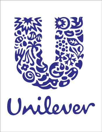
Unilever’s logo is filled with hidden symbols, each representing one of the many product categories the company offers. From a spoon to a fish and a heart, the various icons symbolize everything from food to personal care. The logo, designed in 2004, captures the company’s diversity while keeping a cohesive and modern design. This playful yet meaningful approach emphasizes Unilever’s commitment to improving lives across multiple industries. Each element in the logo reflects a part of their extensive product range.
Mercedes-Benz

Mercedes-Benz’s three-pointed star logo symbolizes the brand’s ambition to dominate land, sea, and air. First introduced in 1909, the logo has remained a key part of the company’s identity, representing both luxury and engineering excellence. The simplicity of the design keeps it elegant, while the star itself reinforces Mercedes’ high standards of quality. It’s a perfect visual for a brand that stands for innovation across all terrains. The logo speaks to Mercedes’ heritage and its forward-thinking philosophy.
NBC
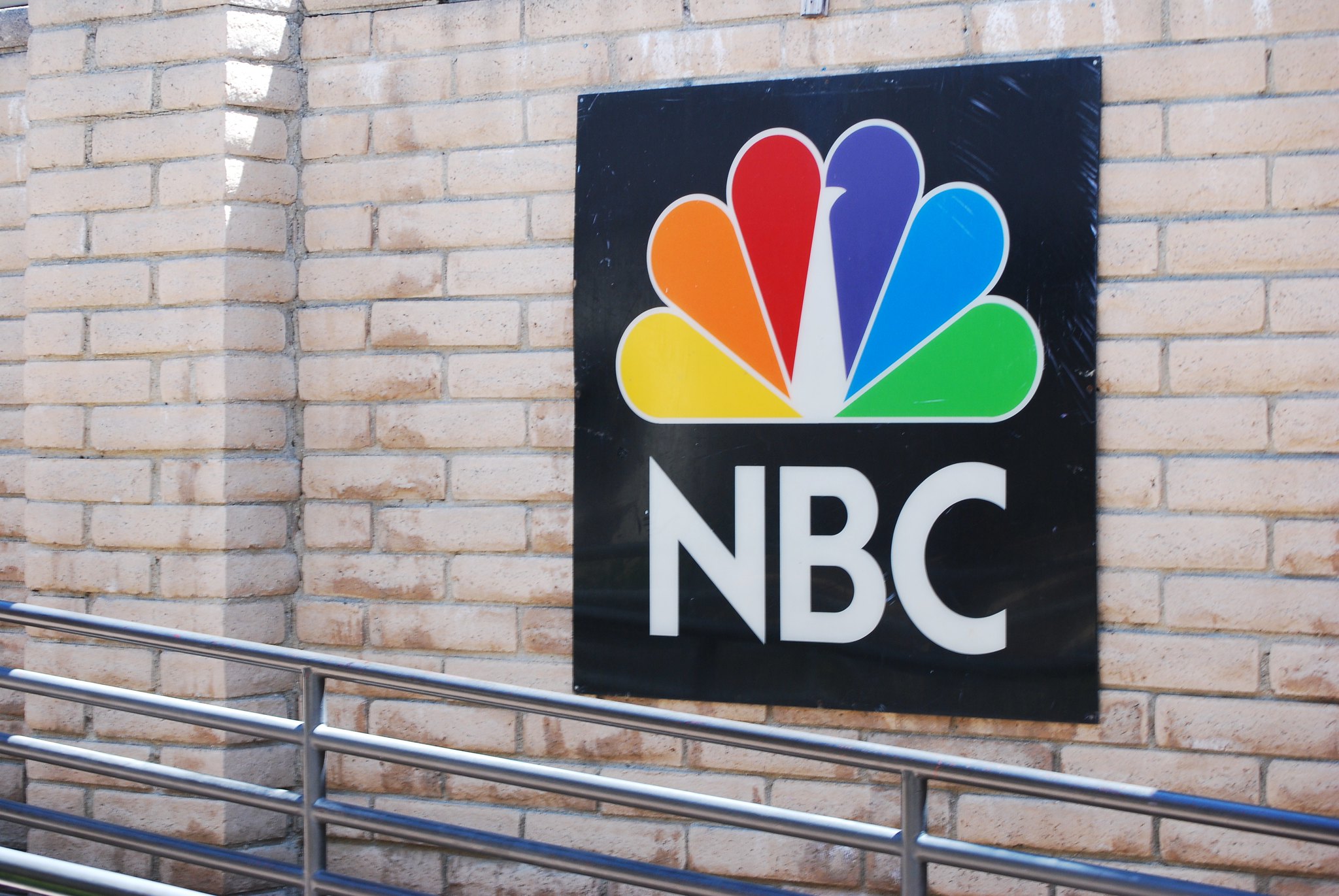
NBC’s logo, featuring a colorful peacock, was designed in 1956 to symbolize the network’s switch to color broadcasting. The peacock’s six feathers represent the company’s six divisions, while its forward-facing direction suggests progress and forward-thinking. The logo’s vibrant colors and clean design make it stand out while tying back to its historic role in television. Over the years, it has undergone slight updates but maintains its core elements. It’s a playful, lively logo that embodies NBC’s creative spirit.
This article originally appeared on UnifyCosmos.
More from UnifyCosmos
18 Hair Care Tips for Maintaining Healthy Locks Year-Round

Healthy hair requires consistent care, regardless of the season. From protecting against harsh weather to nourishing your strands from within, maintaining your hair’s vitality can be simple with the right practices. Read More
17 Beauty Hacks Every Busy Professional Should Know
Balancing a demanding career with looking your best can be challenging. When time is limited, finding quick and effective beauty solutions becomes essential. Read More
16 Dream Destinations for an Epic Rock Climbing Challenge

Rock climbing is a test of strength, endurance, and mental fortitude. For climbers, the world is filled with destinations that offer unique challenges, stunning views, and the satisfaction of reaching new heights. Read More
Leave a Reply