Famous landmarks often hide incredible design details that most visitors overlook. From hidden symbols to intricate patterns, these elements add depth and meaning to the structures we admire. Many of these subtle features tell unique stories about history, culture, and artistry. Let’s explore some surprising design elements in well-known landmarks that you may have missed.
The Secret Apartment in the Eiffel Tower
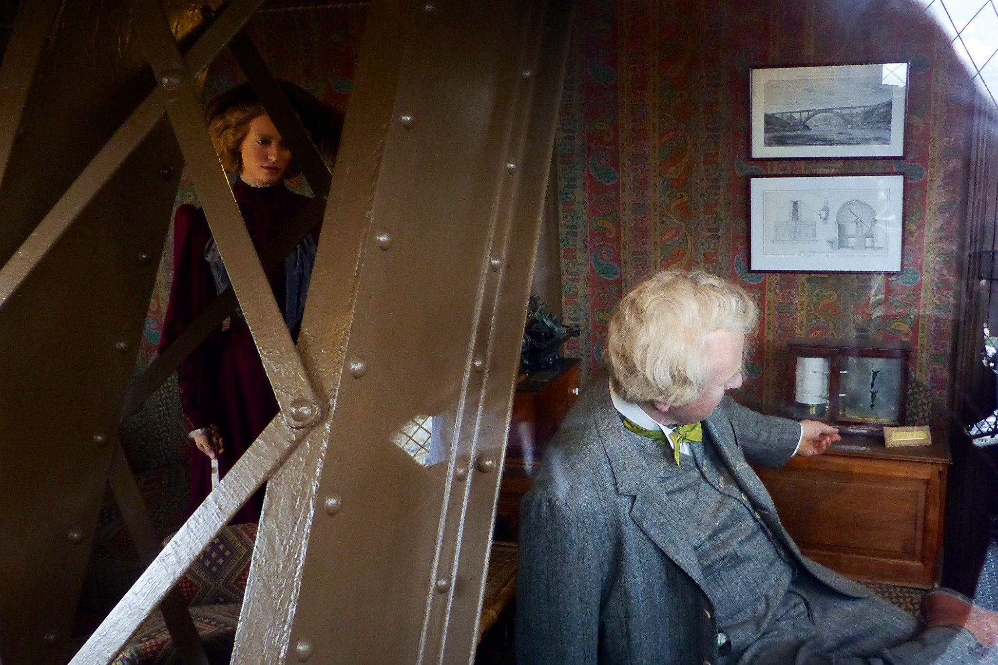
Many visitors don’t know that Gustave Eiffel built a secret apartment at the top of the Eiffel Tower. Reserved for private guests, this cozy space offers a stunning view of Paris. Eiffel used the apartment to entertain notable figures like Thomas Edison. The design, though modest, contrasts with the tower’s industrial iron structure. Today, visitors can peek through windows to see a reconstruction of the room.
The Acoustic Wonders of St. Paul’s Whispering Gallery
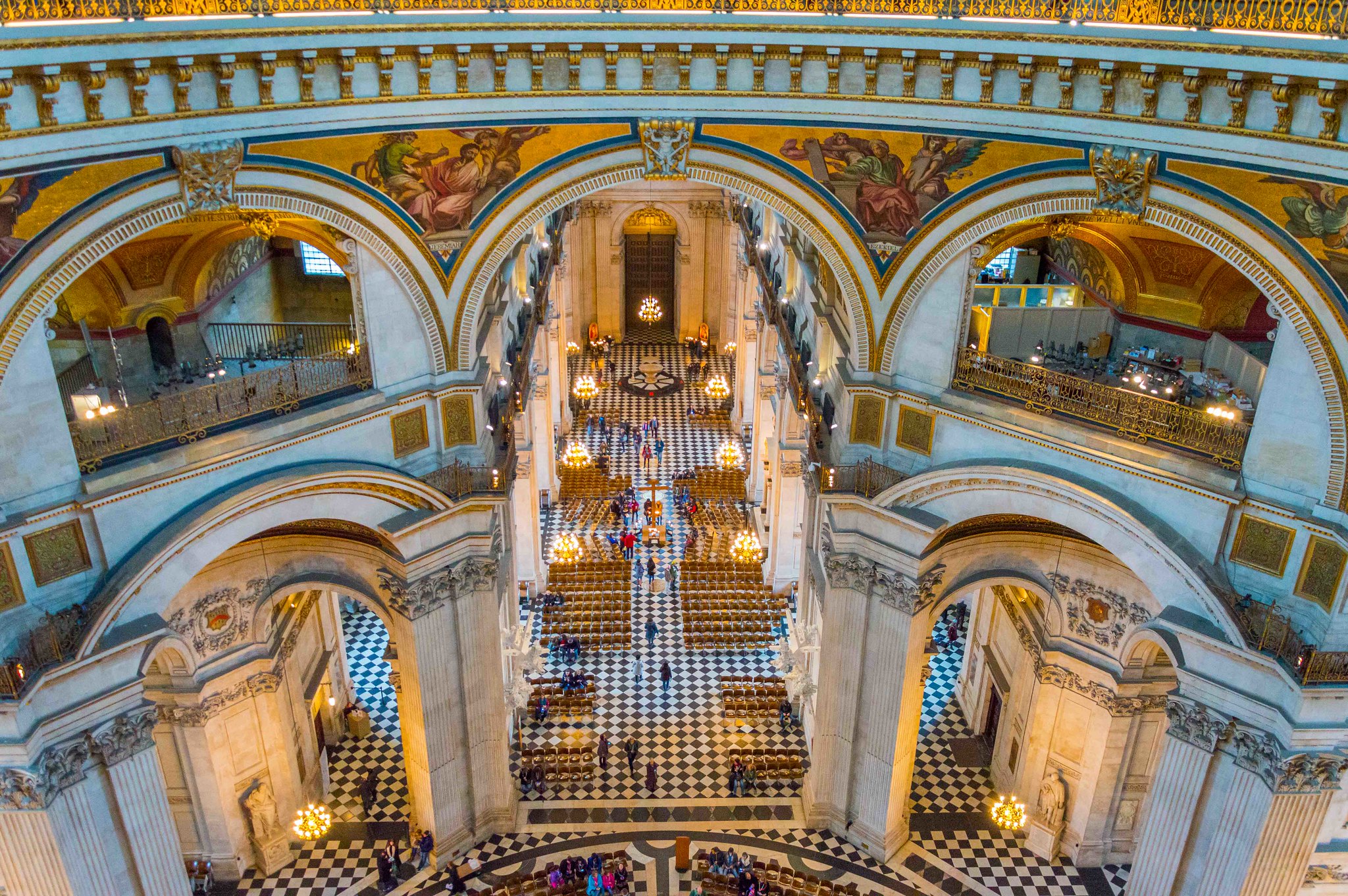
Inside St. Paul’s Cathedral in London, the Whispering Gallery is an architectural marvel. The curved dome creates an acoustic trick where a whisper spoken on one side can be heard clearly on the opposite side. This phenomenon wasn’t planned but adds a mysterious charm to the cathedral. It’s one of the most engaging features that visitors often miss unless told. The gallery itself is a beautiful blend of art and architecture.
The Mysterious Eyes of the Mona Lisa in the Louvre
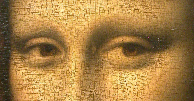
Leonardo da Vinci’s “Mona Lisa” is famous for its enigmatic smile, but fewer people notice the trick behind her eyes. Her gaze appears to follow you no matter where you stand in the room. This effect is created through expert use of light and shadow, known as sfumato. It draws viewers deeper into the painting, making the experience almost interactive. This subtle element makes the artwork endlessly fascinating.
The Hidden Arrow in the Washington Monument

The Washington Monument in Washington, D.C., has a hidden symbol most visitors overlook. There’s a small aluminum pyramid at the top of the monument with an arrow pointing to the heavens. This is the highest point in the city, symbolizing America’s forward progress and ambitions. The arrow is out of sight, yet it’s a powerful design detail that ties into the monument’s purpose. Few realize this intentional connection when admiring the towering structure.
The Inverted Pyramid at the Louvre
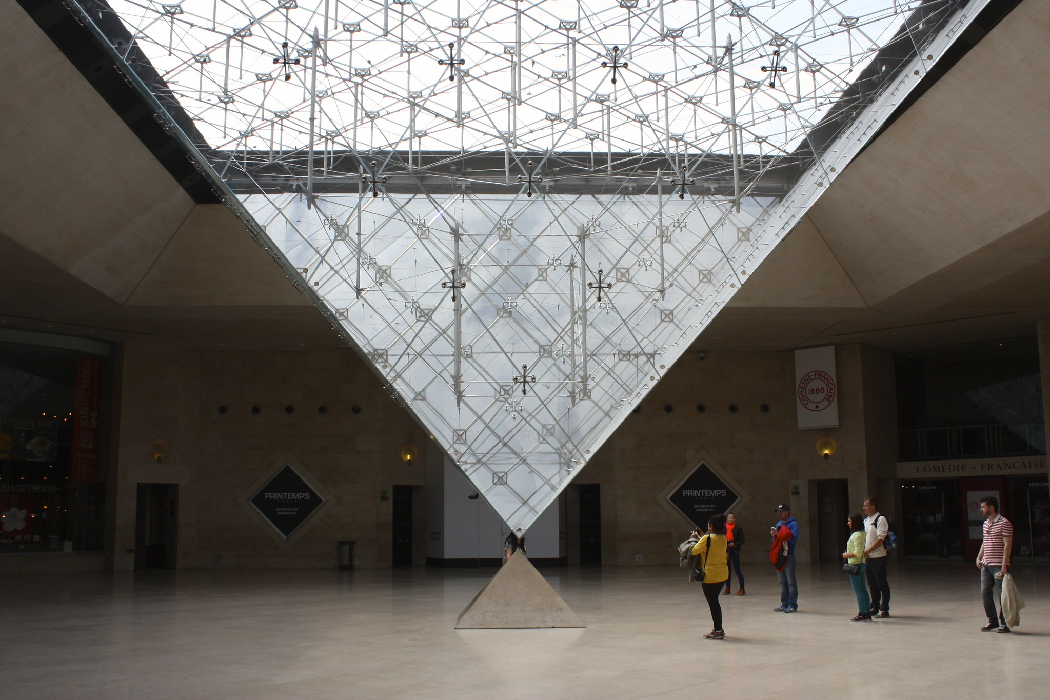
Everyone notices the glass pyramid outside the Louvre, but many miss its counterpart—the inverted pyramid inside. Suspended upside down, this glass structure extends into the museum’s underground shopping center. This design is both artistic and practical, allowing natural light to pour into the subterranean space. It’s an example of how modern design blends with ancient architecture. The two pyramids complement each other, creating a symbolic harmony.
The Unfinished Façade of the Sagrada Familia
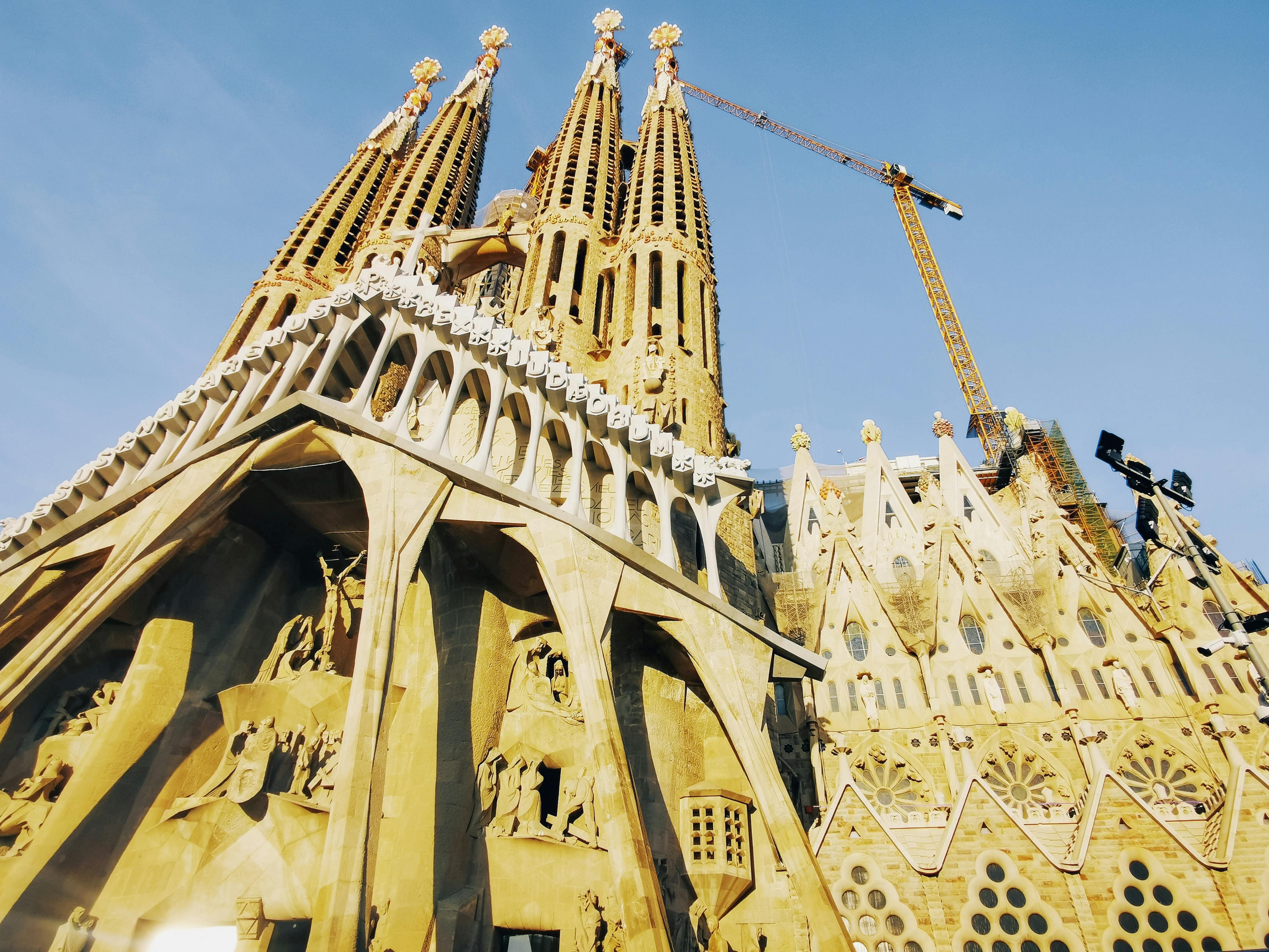
Barcelona’s Sagrada Familia, designed by Antoni Gaudí, has one key feature visitors often miss—its unfinished façade. Gaudí intended the church to be a reflection of nature, constantly evolving, which is why construction is still ongoing. The contrast between the older, more detailed sections and the modern additions highlights this philosophy. While some view it as incomplete, it’s actually a living testament to Gaudí’s vision. The continuous building process is part of the charm.
The Clock Faces of Big Ben
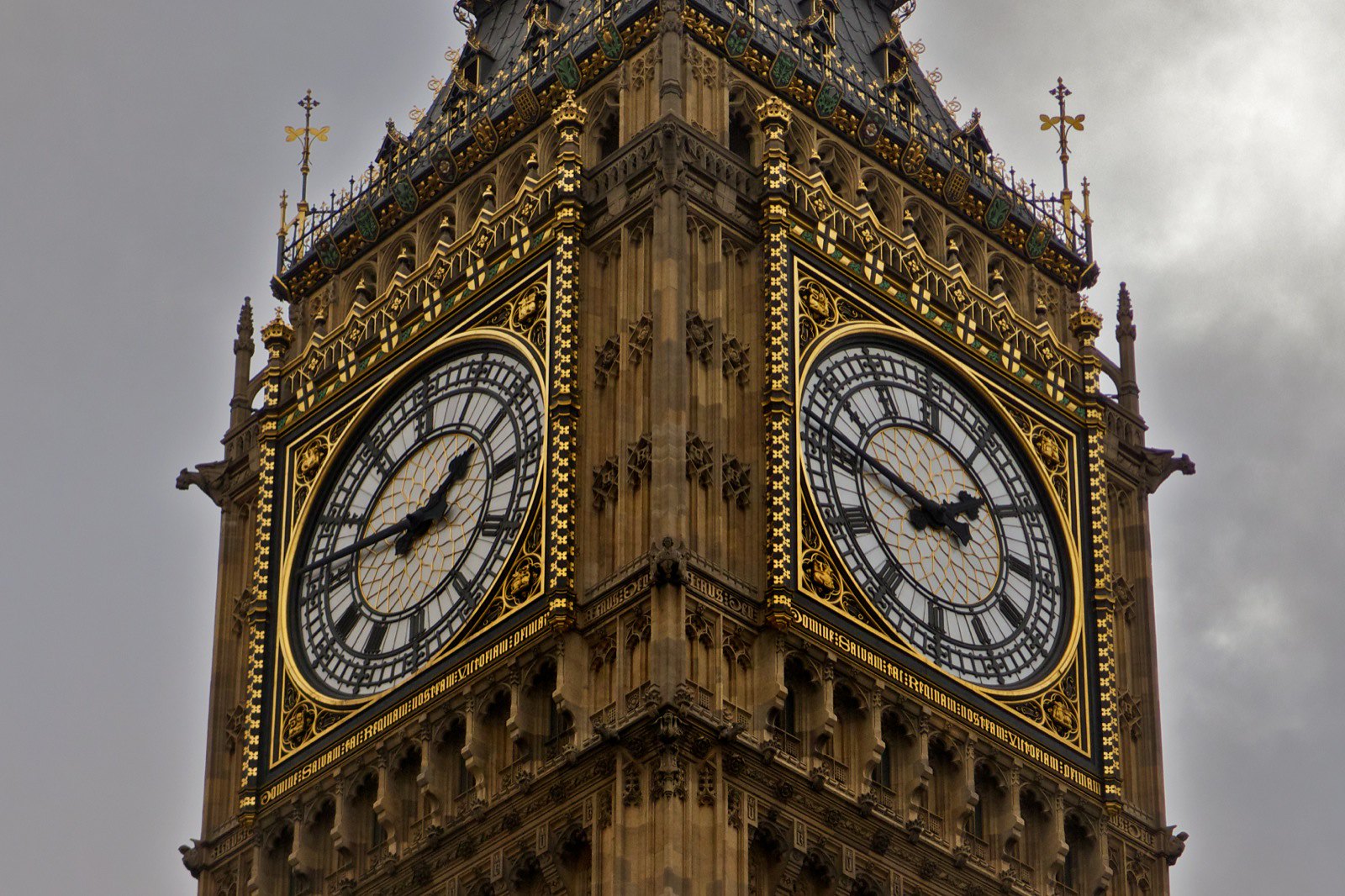
Big Ben’s iconic clock tower in London hides a surprising detail in its clock faces. The numerals are not the standard Roman numerals. Instead of IV for the number four, it uses IIII, which is a more traditional style used in early clockmaking. This small detail connects the clock to historical practices, giving it a timeless feel. It’s a subtle nod to craftsmanship that visitors often overlook.
The Illusion of Leaning at the Leaning Tower of Pisa
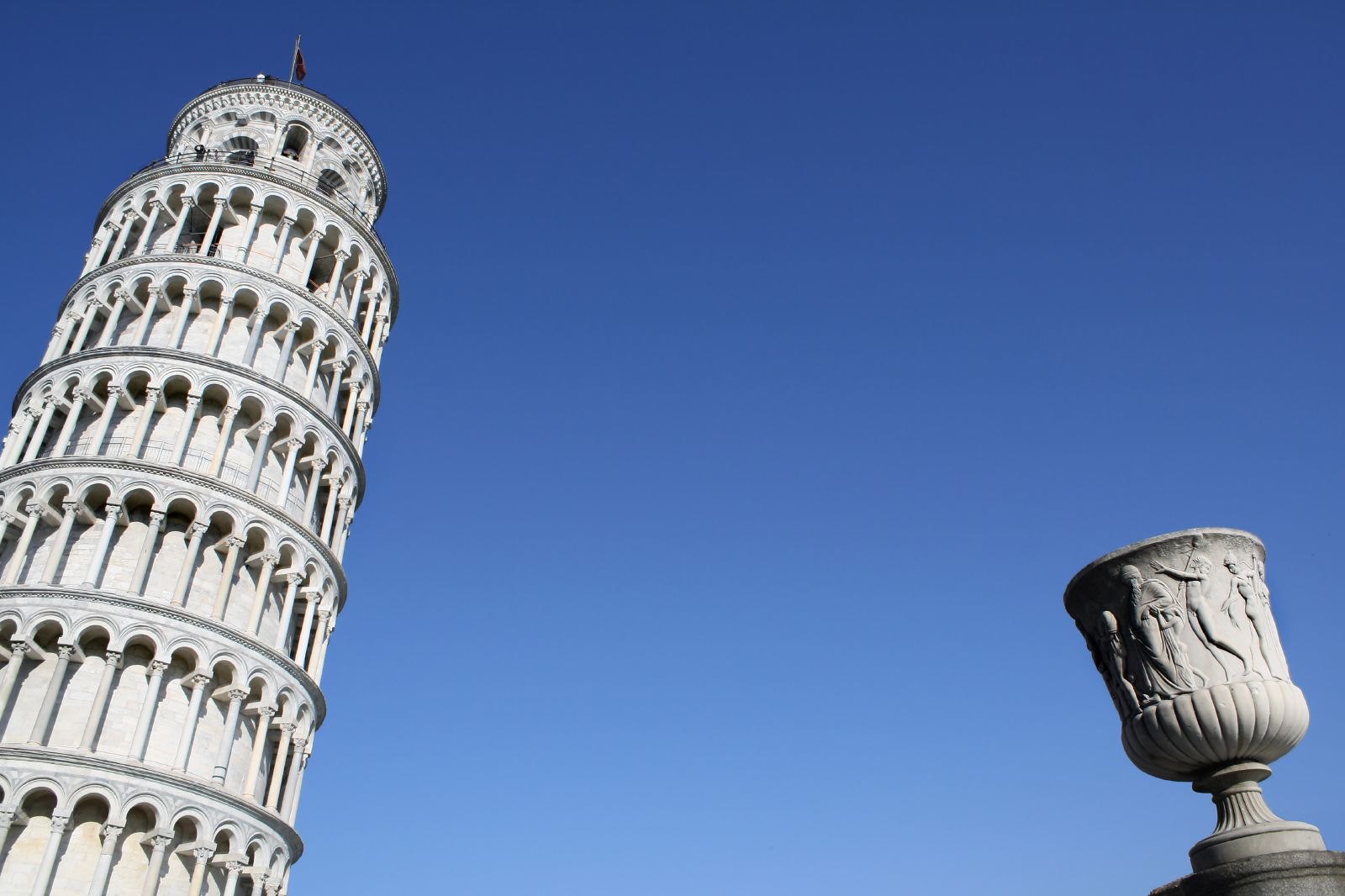
The Leaning Tower of Pisa is famous for its tilt, but the degree of lean is carefully preserved. What many people miss is that efforts have been made to stabilize the tower so that it leans just enough to keep its charm without collapsing. Engineers used innovative techniques to stop further tilting while maintaining its iconic slant. Visitors often focus on the lean without realizing the engineering that keeps it safe. This delicate balance is a hidden marvel in itself.
The Gold Leaf of the Taj Mahal
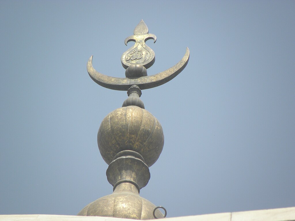
The Taj Mahal is renowned for its white marble beauty, but an often-missed detail is the gold leaf that once adorned its finial. While much of the gold has faded or been stolen over time, it was originally a symbol of wealth and grandeur. The shimmering element added a glowing contrast to the marble, especially at sunrise and sunset. Today, visitors may not realize this luxurious aspect of the monument’s original design. It’s a reminder of the Taj Mahal’s opulent past.
The Hollow Columns of the Parthenon
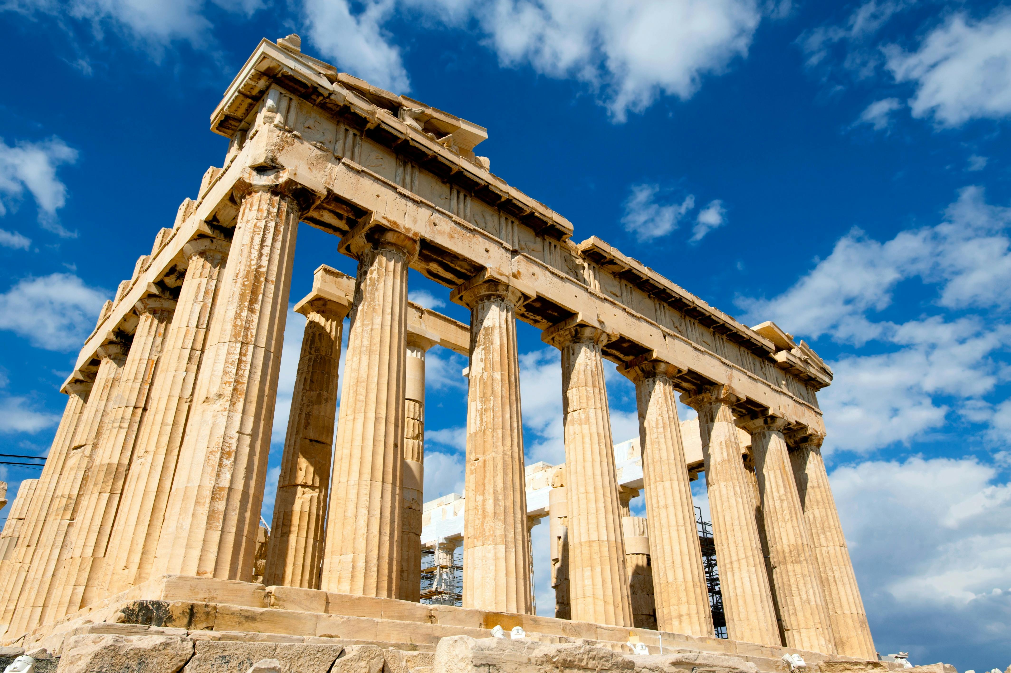
The Parthenon in Athens is known for its classical architecture, but its columns are not solid, as many assume. They’re built from stacked drum-shaped pieces, each slightly tilted to create an optical illusion of straightness. This technique, called entasis, makes the columns appear perfectly straight from a distance. It’s a subtle yet ingenious design element that adds to the temple’s grandeur. Without this hidden feature, the Parthenon’s iconic look wouldn’t be the same.
The Hidden Chamber in the Great Pyramid of Giza
While the Great Pyramid of Giza is one of the Seven Wonders, a surprising feature is its secret chambers. A relatively recent discovery revealed an empty void above the Grand Gallery. This chamber, though inaccessible, has sparked theories about its purpose—possibly for structural relief or hidden treasures. The mystery adds to the pyramid’s allure, offering more than meets the eye. It’s a reminder that ancient monuments still hold secrets.
The Optical Illusions in the Palace of Versailles Hall of Mirrors
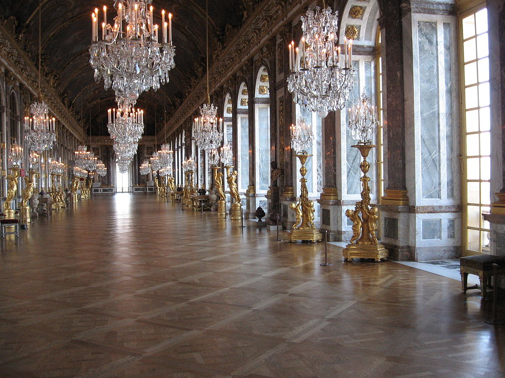
The Hall of Mirrors in the Palace of Versailles is famous for its grandeur, but few notice the intentional optical illusions. The mirrors are strategically placed to amplify the natural light from the windows, making the hall appear much larger and more opulent. This design creates a feeling of endless space and luxury. It also reflects the garden views, bringing the outside into the hall. This careful design makes the hall an immersive experience.
The Dual Purpose of the Colosseum’s Trapdoors
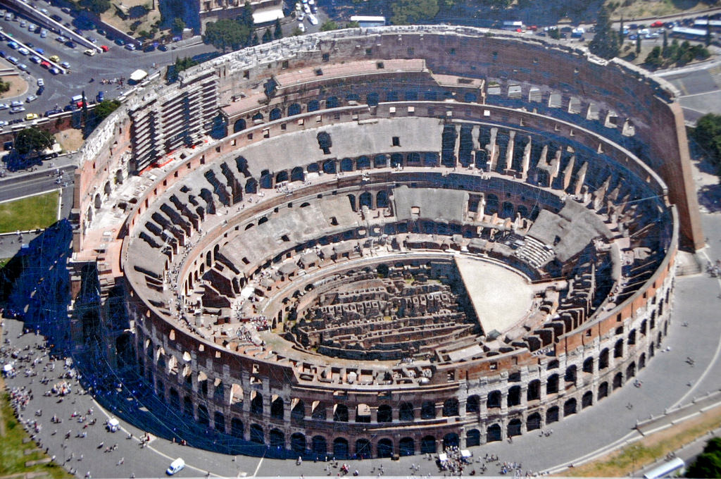
The Roman Colosseum is renowned for gladiatorial battles, but its floor had a sophisticated system of trapdoors. These hidden doors allowed animals and gladiators to appear suddenly, adding an element of surprise to the events. The engineering behind the system was advanced for its time, showcasing Rome’s ingenuity. Visitors may overlook these details while focusing on the grandeur of the structure. However, these elements contributed to the spectacle that the Colosseum is famous for.
The Reflective Surface of the Vietnam Veterans Memorial

At first glance, the Vietnam Veterans Memorial in Washington, D.C., seems like a simple black wall, but its reflective surface is a key design element. Maya Lin, the designer, intended for visitors to see their own reflections alongside the names of the fallen soldiers. This creates a personal connection and invites contemplation. The minimalistic design is powerful in its ability to merge past and present. Visitors often feel a deep emotional impact because of this subtle feature.
The Tilted Windows of the Louvre Museum
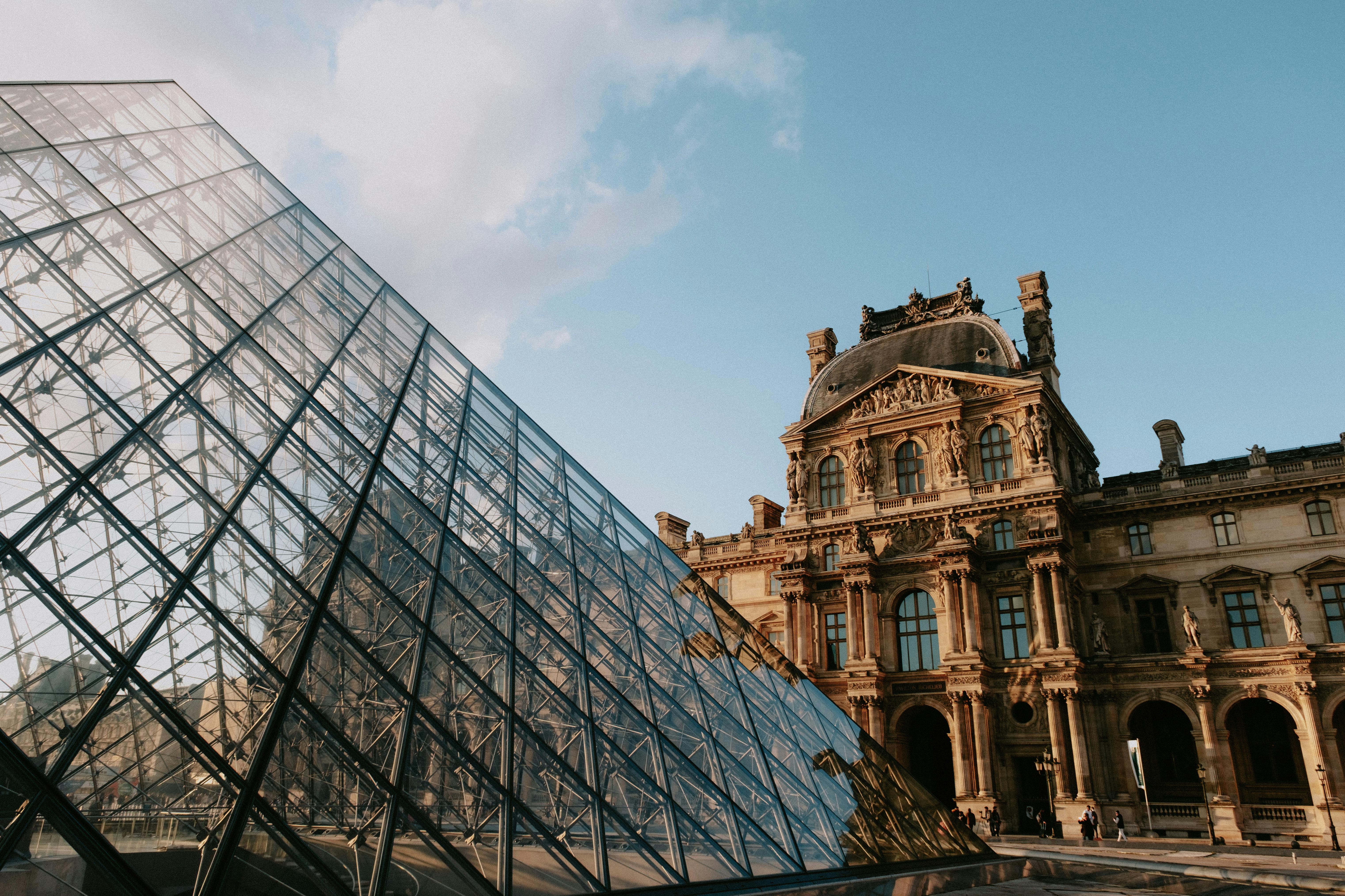
The Louvre Museum is filled with art, but its building design has a hidden quirk—its windows are tilted. This slight angling helps diffuse light more evenly inside the museum. It reduces glare on the artworks and enhances the viewing experience. Most visitors don’t notice the tilt unless they look closely. This feature shows how practical design can enhance the beauty and functionality of a space.
The Spiral Staircase of the Vatican Museums
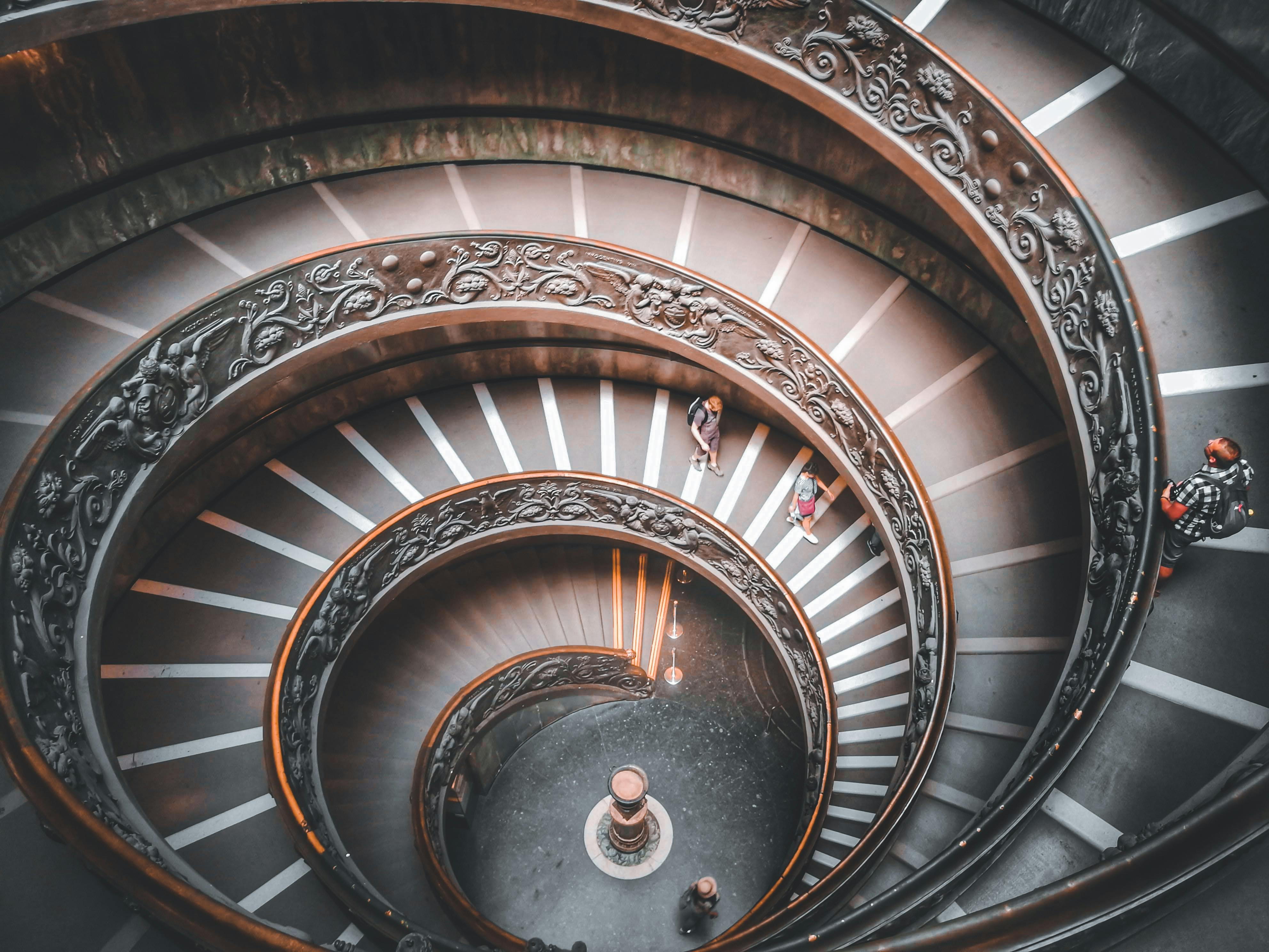
The Vatican Museums are filled with treasures, but their double-helix staircase is a marvel in itself. Designed by Giuseppe Momo, the spiral staircase has two stairways that never intersect—one for ascending and one for descending. This design helps with crowd flow while also being visually stunning. The elegant, coiling structure often goes unnoticed as visitors rush through. Yet, it’s one of the most photographed features when pointed out.
The False Windows of the Palazzo Vecchio
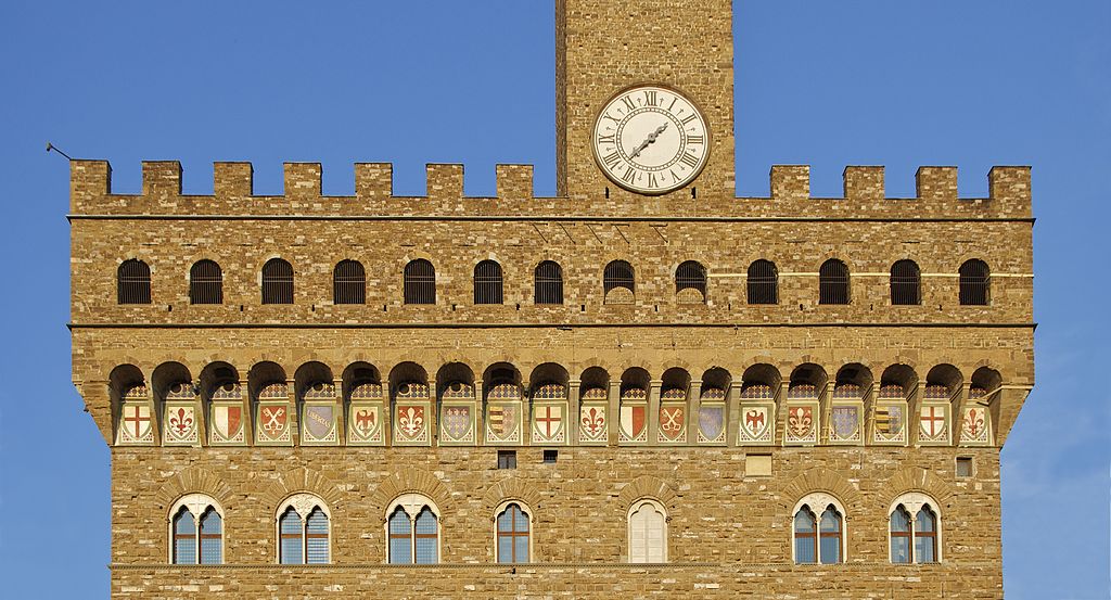
Florence’s Palazzo Vecchio is a symbol of the city’s political history, but many visitors miss the fake windows on the building’s façade. These windows, painted to look real, were added for aesthetic balance. They were a practical solution to maintain the building’s symmetry without altering the structure. It’s a clever, subtle design element that helps the building’s appearance without functional use. Many walk past without realizing this optical illusion.
The Secret Fountain of the Trevi Fountain
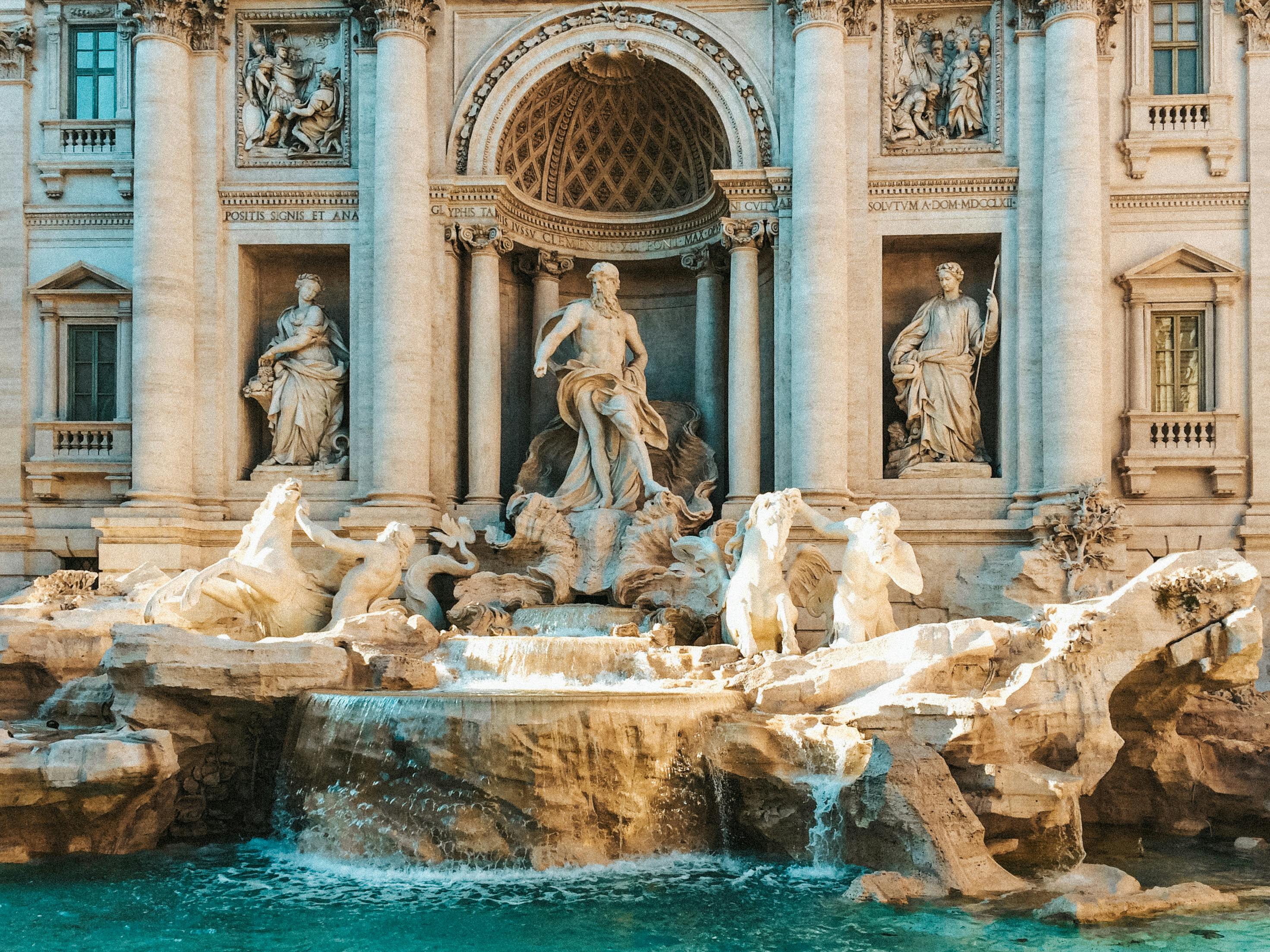
Rome’s famous Trevi Fountain holds more than just wishes. There’s a small, hidden drinking fountain on the side, known as the “Fountain of Lovers.” It was historically used by couples as a promise of fidelity, where drinking together ensured everlasting love. This hidden feature is overshadowed by the grandness of the main fountain. Yet, it carries a romantic tradition often missed by visitors.
The Secret Messages in the Statue of Liberty
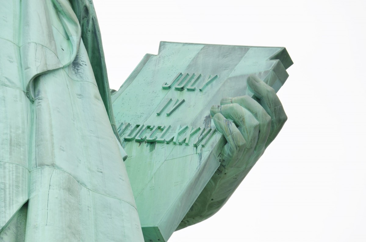
The Statue of Liberty in New York is a symbol of freedom, but the book in her hand carries a subtle message. The date inscribed, July 4, 1776, is a direct reference to the Declaration of Independence. Few people focus on this detail as they admire the statue’s overall form. It’s a simple yet powerful reminder of what the statue represents. This design feature anchors the statue to American history.
The Masonic Symbols in Washington D.C.
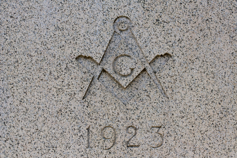
Washington D.C. is filled with hidden symbols, especially related to Freemasonry. Many of the city’s landmarks, including the U.S. Capitol and the Washington Monument, contain Masonic symbols like the compass and square. These elements were intentionally included by the designers, many of whom were Freemasons. Most visitors pass by without realizing these subtle nods to the fraternity’s influence. These design choices add a layer of mystery to the city’s architecture.
The Equinox Alignment of Machu Picchu
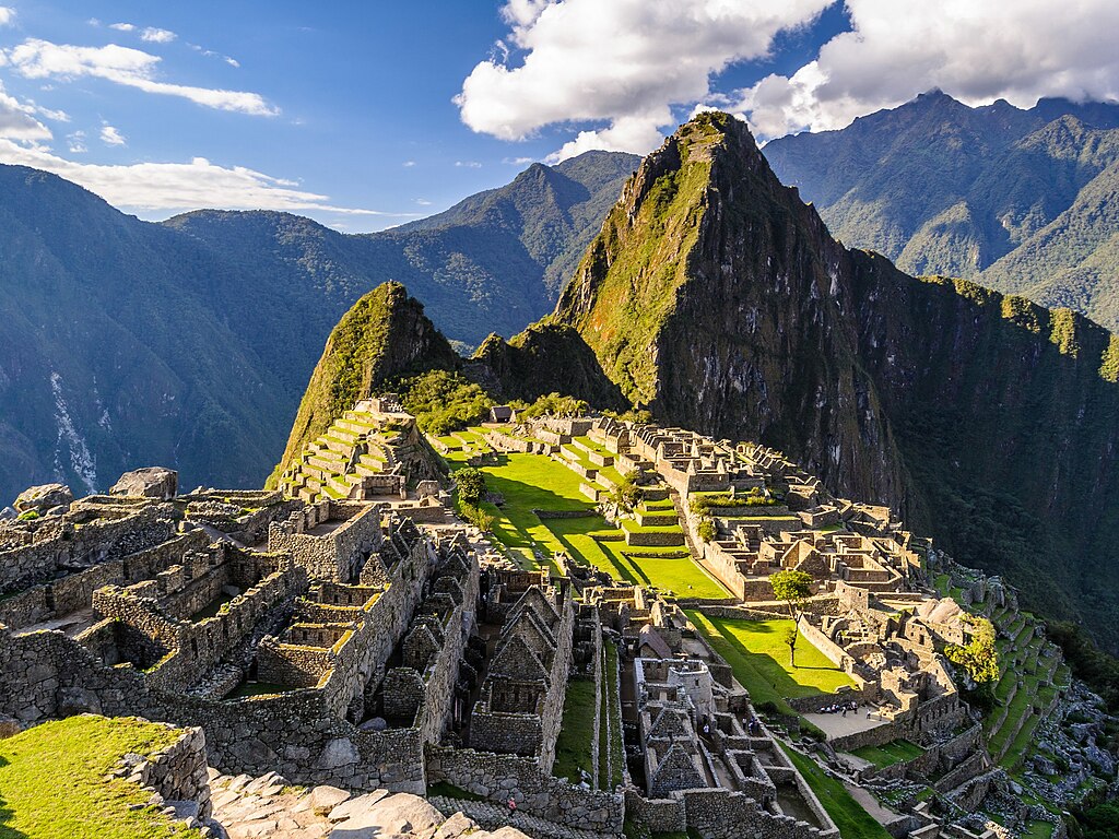
Machu Picchu in Peru is known for its breathtaking views, but its design also aligns with the equinoxes. The central temple and several other structures are positioned to mark the sun’s movement during the spring and autumn equinoxes. These alignments were used for agricultural and religious purposes. The precision of the design shows the astronomical knowledge of the Inca civilization. Most visitors admire the site without knowing about these celestial connections.
This article originally appeared on UnifyCosmos.
More from UnifyCosmos
The 19 World’s Most Expensive Hotels for a Lavish Stay

If you’re dreaming of a stay that combines luxury, exclusivity, and breathtaking experiences, the world’s most expensive hotels offer just that. These hotels provide unparalleled service, stunning locations, and opulent amenities that go beyond the ordinary. Read More
17 Skipping Maintenance Tasks That Lead to Costly Repairs

Skipping routine maintenance might seem like a way to save time or money, but it often leads to expensive repairs down the road. Simple tasks left undone can cause bigger problems that require more effort to fix. Read More
20 Common Misunderstandings When Learning a New Language

Learning a new language can be an exciting but challenging journey. Along the way, it’s easy to encounter common misconceptions that can slow progress. Read More
Leave a Reply